
Daily Huddle Tool
Affirm Health
Project Overview
Conduct research and redesign the Daily Huddle Tool web application, which is currently being used by hundreds of primary care clinics in 10 U.S. states to help increase efficiency and profitability.
My Role
Heuristic Analysis, User Interviews, Affinity Mapping, User Personas, Task Analysis, Storyboarding, User Flows, Wireframing, Visual Design, Hi-Fidelity Prototyping
The Problem
Many doctors prefer information to be displayed tightly.
The majority of doctors and nurses still prefer to use paper over computer screens.
This limits the potential of what clinics can gain by using a computer.
Business Goals
Increase efficiency and user friendliness of using the tool.
Increase number of doctors, nurses, and medical assistants that use the Daily Huddle Tool on their computers rather than print it off— so that customers can ultimately gain more value and efficiency from the tool.
Increase customer value of product = increase cost of product
Challenges
Most doctors prefer that information be densely/tightly displayed, which goes against common design ideology.
Most doctors do not like change and see technology as a necessary evil.
The size of the design needs to fit within standard print size.
The Healthcare system in the U.S. is extremely complex.
There are many backend technical challenges and barriers that currently limit what can be done.
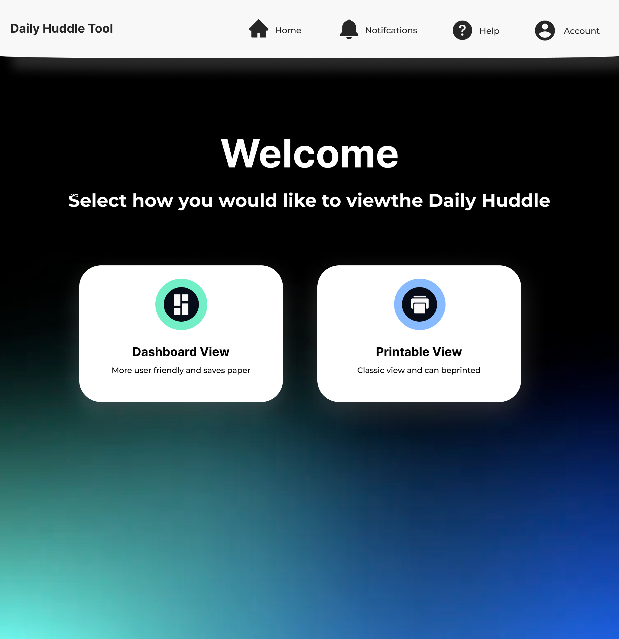
The Solution
An interface that gives users the option between a traditional (printable) view or a modern digital view that provides more features that users want while making it user friendly and efficient.

Heuristic Analysis
Difficult to scan / lacks use of bolding and other useful visual elements.
Top header could be more clearly defined visually.
Blue “Reload” Banner feels like it should be higher up on the page.
Unclear if the pill shaped icons are tags or buttons.
Feels out dated.
Initial Redesign
Concept #1

Concept #2


Contextual Interviews
Some of the questions asked:
How do you use the Daily Huddle Tool?
What do you like most about the Daily Huddle Tool?
What do you like least about the Daily Huddle Tool?
What would your dream function be?
How much time do you spend using the digital version versus the printed version?
Do you or anyone in your office use the notes section?
What would make you more likely to use the digital version?
What information on the DHT is the most important / what do you look for first?
Is there any information that seems irrelevant or that you skip over?
If you could design the DHT what would you do?
Affinity Map

Personas


Task Analysis
Schedule Annual Wellness Visit
One of the most important tasks that primary care practices need to do is to make sure that patients get scheduled for annual wellness visits. This like many other things, would be made easier if there was one button a nurse or doctor could click that would automatically schedule an annual wellness visit or at the very least notify the scheduler to schedule an annual wellness visit. However, this is currently not technically feasible.
This exercise helped us to break down the step-by-step process that primary care practitioners go about ensuring patients get scheduled for annual wellness visits before they leave the office (if they’re ready for one). This helped us come up with ideas for how to improve process with the Daily Huddle Tool.

Technical Feasibility

Not Feasible Right Now
Hospitalizations
Integrate ability to have Quality Measures transfer into the chart prep
Diagnosis could cluster and stick with meds. Attach to the last diagnosis that was used to order.
Rx fills are challenging to track because they are not tracked in the EHR
Order vaccines / store vaccination history
Duplicative work in chart prep
Allow notes to be stored back in chart
External data issues
Concept Sketches


User Flow (Main User Experience)

Wireframes
First Time - Select View

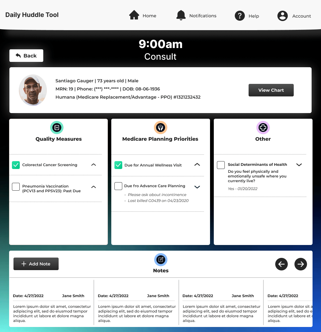
Home Page

Appointment / Patient Page

First Time - Save Preference

Home Page - Completed Appointments

Visual Design
Outside of the visual design component of this final iteration, I also made some slight changes to the user experience itself based on further conversations and considerations. Most notably, I changed the “View Chart” button on each of the appointment modals on the dashboard to be “Mark Appointment Complete”. I then added the “View Chart” button to the full patient appointment view because this is where doctors/nurses would prefer to have this feature. The “Mark Appointment Complete” buttons on the dashboard would then in turn give users additional functionality to visually show which appointments had been completed.


Motion Design
Figma Prototype
Usability Testing
We conducted in-person usability testing with two doctors, 1 nurse, and 1 medical assistant
Task 1 (mark appointment complete): 100% pass, SEQ: 6-7-7-7,
Task 2 (view an appointment): 100% pass, SEQ: 7-7-7-7
Task 3 (close out Quality Measures): 100% pass, SEQ: 6-6-7-7
Task 4 (add a new note): 100% pass, SEQ 7-7-7-7
Task 5 (switch between dashboard and print view): 100% pass, SEQ 7-7-7-7
Outcome
20% increase in users using the Daily Huddle Tool on their computers.
Significant Increase in positive feedback and customer satisfaction.
Design of the mobile web-app experience for the 2022 Camp McDonald’s promotion, which allowed McDonald’s customers that used the McDonald’s app to make their purchase to gain access to merchandise and free online concerts for famous artists including Kid Cudi.