
T-MOBILE
Sync-UP KIDS Watch: School Mode Navigation


Overview
Background
I led the design of many features for both the Sync-UP KIDS Watch and the accompanying mobile app, but here I will be presenting the redesign of the mobile app based upon the business’s goal of increasing the use of the School Mode feature.
School Mode is a T-Mobile trademarked term used for what is essentially their “Airplane Mode” for the Sync-UP KIDS Watch. When School Mode is activated it limits the watch’s functionality such as alerts, games and texting.
Business Goals
Increase the awareness and understanding of School Mode.
Increase the usage of School Mode.
My Role
Product Designer and Researcher.
My Team
Emerging Products Team - Over 30 designers divided up into different groups for specific products. I was in a 3 person pod for the Sync-UP KIDS Watch product. Each of us worked individually on features, but met multiple times a week to review each other’s work.
Timeline
October 2022 - January 2023
Tools
Figma, UserZoom, Slack, Miro, Jira
The Problem
Teachers and schools want to ban smartwatches because they often make noise and disrupt the classroom.
Parents aren’t utilizing the School Mode feature enough. Many of them don’t even know about School Mode and if they do they don’t know what it’s for.


The Solution
Redesign the dashboard and navigation to make it easier to find and understand what School Mode is.
Add Scheduled School Mode so parents don’t have to constantly remember to turn School Mode on and off.
Pause toggle for Scheduled School Modes so parents don’t have to delete and recreate them due to summer/winter break.

Old Design


User Interviews
I conducted weekly interviews with different parents who own the Sync-UP KIDS Watch. I also looked at online reviews posted on placed like the Apple App Store and Reddit.
Key Findings
Unaware Users: Many users aren’t aware of the functionality in the app (School Mode") that can limit distractions from the watch. User don’t know what they can do, and their first intention is to shut down or mute the watch or take the watch away (don’t let kids wear it at school).
Aware Users: The users that are aware of the app functionality (School Mode feature) often don’t know how they can do it when there is a need to limit distractions from the watch.
Schedule School Mode: Users of School Mode requested the ability to schedule School Mode so they don’t have to constantly remember to press School Mode on and off.
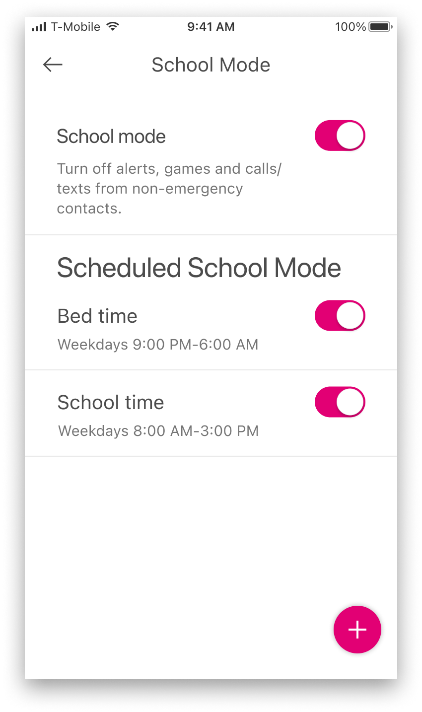
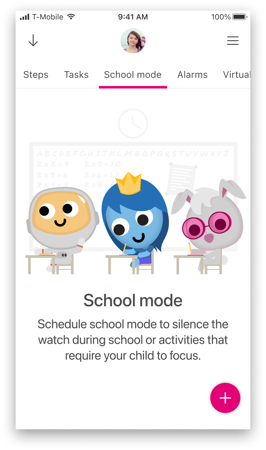
Scheduled School Mode
Getting a quick win
First, a new School Mode section was added to bottom swipe-up drawer where users could schedule School Modes. Although this did make many current users of School Mode happy, many users still weren’t using or they were overlooking this feature. Part of the issue was that many users, especially first time users, still didn’t understand what School Mode itself was.

Further Interview Findings
Many users weren’t using the swipe-up bottom drawer that contained many important features including the ability to schedule School Mode. Most features could be accessed via the hamburger menu on the dashboard, which many people used instead of the bottom drawer. However, it didn’t include School Mode.
Users wanted to have the ability to pause a scheduled School Mode. For instance for summer break when the kids aren’t in school. This way they don’t have to recreate the Scheduled School Mode.


Brainstorming
With these different problems in mind, I took a step back to rethink holistically about how to redesign the application.
Began considering and sketching out ideas for a pause feature for Scheduled School Mode.
At the same time, it was clear that the issue of navigating/discovering School Mode was still an problem. Therefore, I decided to conduct an experiment to help figure out the best way to design the navigation for School Mode.
Hypothesis
Although the hamburger menu is not an ideal place to put key features, I believe that in the short term it might be better to utilize the hamburger menu for School Mode along with the other features that are in the bottom-drawer including Tasks, Steps, Alarms and Virtual Boundaries.
In the long-term a complete redesign of the application will likely be needed, especially as more and more features get added.

Hamburger Menu v.s. Bottom Drawer
Unmoderated Usability Testing
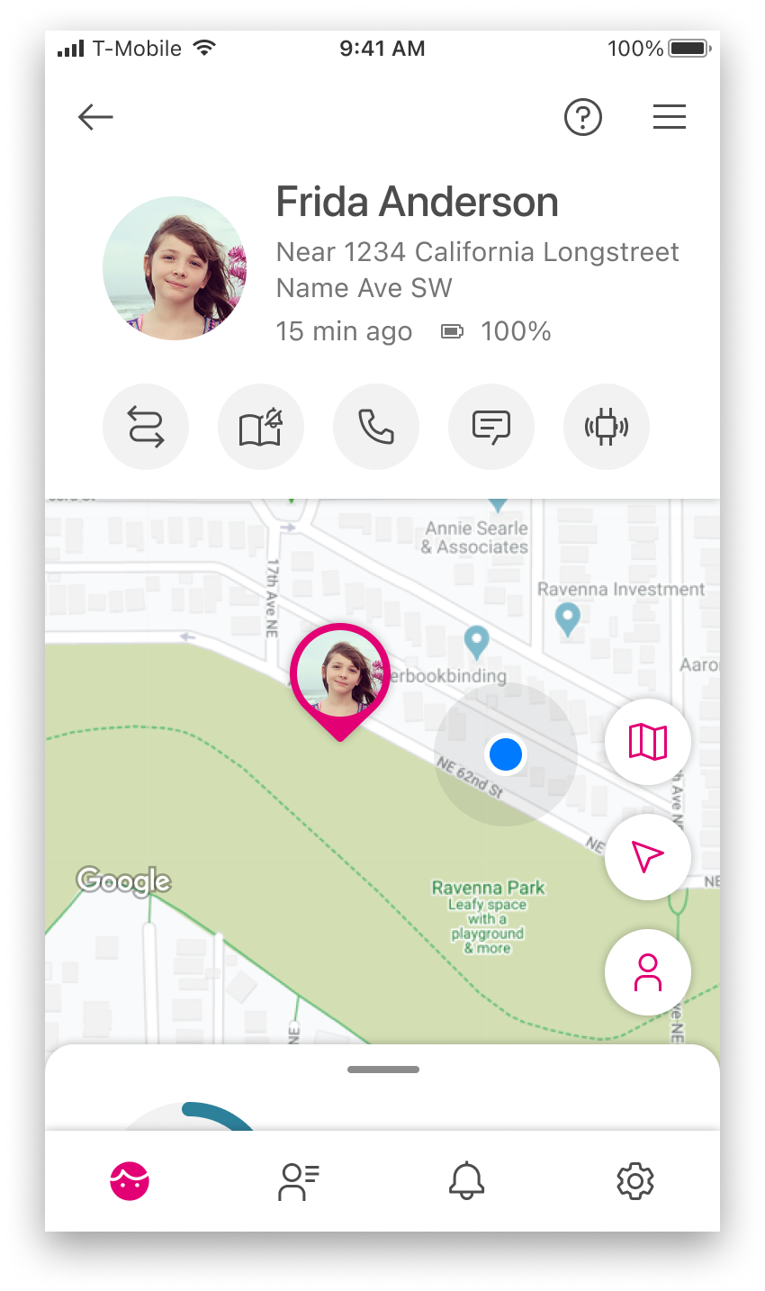
I decided to run an experiment by creating a new prototype and removed the buttons on the dashboard and the bottom-drawer and then put School Mode in the hamburger menu as it’s own item and then again within parental controls. I then tested these designs against each other to find out where users would navigate to “where they can limit the child’s usage of the watch”.
Goals of Study
Find out which design is more user-friendly for navigating to School Mode.
Understand users’ preference for navigating School Mode.
Understand how easily users can navigate to calling and live-tracking in the new design.
Study Design Highlights
Platform: UserZoom
Unmoderated Usability Study
A/B Test of two different versions of the application
Randomized order of tasks
15 users


Synthesizing Results


Key Takeways
Confirmed most users weren’t using the bottom drawer or at least not going there before going to the hamburger menu.
Many first time users don’t understand that School Mode is for limiting a child’s usage of the watch. They don’t know what School Mode is for.
Sometimes people get lucky with the current design and click the School Mode button, but most of the time not.
The pop-up drawer that explains School Mode in the current design helps users understand what it’s for.
Many users click on the gear icon Settings in the bottom right corner first before looking in the hamburger menu or other places.
Most of the time users went to School Mode under parental controls, but the users that went straight to School Mode in the hamburger menu liked that it was there too.
Users like words/descriptions.

Design Recommendation & Constraints
I recommended a complete redesign of the dashboard and possibly the entire application because there are some systemic problems with the current design. Most notably, the gear settings icon at the bottom right and the hamburger menu at the top left is not a common design pattern and it clearly confused a lot of people.
However, due to timeline constraints the business wanted to hold off on a complete redesign because that would likely take several more months to design and test.
Design Exploration
After the decision was made to work on making smaller incremental changes to the design and navigation of the app, I took some time to explore possible designs solutions to test. My main concern that drove this exploration was how best to visually differentiate the School Mode toggle from pause toggles for Scheduled School Modes.
Competitive Analysis
I decided to conduct some competitor research to see how they named their “School Mode”, where they put the feature and how they handled on-demand toggling versus scheduling “School Modes”.
Apple
Apple does not have a specific watch just for kids. Therefore, you have to configure the Apple Watch to be kid friendly. Apple offers a ton of settings within different areas of the iPhone including the iPhone Settings and watch app. Apple has a similar feature called “Schooltime”, and the has a toggle and scheduling feature adjacent to each other. I also took into consideration features like Airplane Mode and Alarms.
Verizon
Verizon’s version of the kids watch, Gizmo, functions much more closely to the T-Mobile kids watch and mobile companion app. The watches are designed specifically for kids and the mobile companion apps are designed specifically for parents to control the watches.
The Gizmo also has a school mode feature, but it is called “Quiet Mode” or at least at the time of this project it was called that. However, the Gizmo app has the “Quiet Mode” toggle and the scheduling feature adjacent to each other.


Design Decision
For this re-design I took what seemed to work well from the different designs and combined them together while also adding some new things to help the user find and understand, not just School Mode better, but the entire interface better.
For example, I put labels underneath the icons on the bottom nav bar. All of these changes were made to help reduce cognitive overload and make decision-making easier, which would ultimately help users find School Mode as well. However, the most important change I made was removing buttons from the dashboard in order to make the Live-Tracking and School Mode buttons larger and have labels.


Unmoderated Usability Test #2
This next test used the same test questions/task structure, but instead of two different designs there were three different designs. In addition to navigation in School Mode, I also tested navigation to Scheduled School Mode.
Goals of Study
Confirm if the updated design is intuitive to the user and if School Mode can be found more quickly than the previous designs.
Understand if the placement of Scheduled School Mode is intuitive to users
Identify if and to what extent users understand School Mode and Scheduled School Mode
Study Design Highlights
Platform: UserZoom
Unmoderated Usability Study
A/B/C Test of three different versions of the application
Randomized order of tasks
15 users


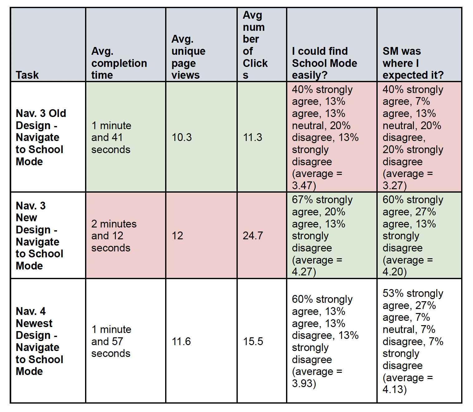
Sythesizing Results
Key Takeaways
Users clearly understood Scheduled School Mode and were able to locate it quickly and with relatively few clicks.
However, users didn’t think Scheduled School Mode was especially easy to find or intuitively located.
For the navigate to School Mode task, both the third design and the first design performed significantly better than the second design.
The third design performed slightly worse than the first design. However, based on qualitative data, it seems that this is likely for two reasons:
The color contrast of the buttons and labels.
Some first time users don’t think the term “School Mode” means to silence the phone, therefore, when presented with third design where the button is labeled with “School Mode”, they don’t even try clicking it.
Although users liked where School Mode was located, many users expected School Mode to be located under Settings. Some (7/15 users) initially selected Settings and needed to backtrack and explore other options. A few (3/15 users) explicitly mentioned intending to select Settings, but saw School Mode before they selected Settings.
Qualitative Data
“I found it quickly and easily. It was not hard to find.”
“It’s located towards the top of the page and clearly labeled as such.”
“It’s like airplane mode for a specific range. You can limit usage of the watch for all purposes beyond calling with a click of a tile.”
“Turns it on silent and limits functionality that would distract from school work.
“I feel like I do like the location of where that's at, but I just really thought that it would have been under Settings.”
“However I feel like it should be under Settings. It just makes more sense to me.”
“Originally I was going to click on Settings but I saw a School Mode. It stood out and that made sense based off of the scenario.”
“I had a hard time finding it at first because I thought it would be located under Settings which is where you go to turn off alerts and notifications”
Quantitative Data

Design Decision
Despite the quantitative results of the user tests pointing towards a slight redesign of the old (first) design, the qualitative results complicated the picture and suggested that a redesign of the newest (third) design could be just as good if not better in regards to finding School Mode and Scheduled School Mode easily and understanding what both of these features do.

Navigation Flow
Despite the quantitative results of the user tests pointing towards a slight redesign of the old (first) design, the qualitative results complicated the picture and suggested that a redesign of the newest (third) design could be just as good if not better in regards to finding School Mode and Scheduled School Mode easily and understanding what both of these features do.
Interactive Prototype

Additional Considerations
Systems Thinking - Iceberg Model
Events: Some parents still aren’t turning on School Mode or creating Scheduled School Mode.
Patterns/Trends: The usage of School Mode and Scheduled School Mode has been trending upward, but there some parents that still aren’t understanding/finding SM or SSM. Some parents simply don’t care and won’t use School Mode even if they know what it is and how to use it. Some parents actively message back and forth with their kids while they’re at school.
Underlying Structures: An increase in safety concerns due in large part to the increase in school shootings. A sense of individualism and/or misunderstanding about what the school system or government can do (ban smartwatches in school).
Mental Models: My child’s safety is more important than anything else. The school system or government wouldn’t or can’t ban the use of smartwatches.
Additional Design Updates
Tutorial Screens
Pausing for Tasks, Alarms and Virtual Boundaries
Outcome
Redesign resulted in a 25% increase in the use of School Mode.
Significant increase in customer satisfaction from interviews and app reviews.
Challenges
By far the biggest challenge had to be not being able to change the name of “School Mode” to something more universally recognized and understood.
The Child Dashboard page was already filled with icons/buttons— so there wasn’t much/if any real estate to add new features.
The relationship between the “on-demand School Mode” button on the Child Dashboard and the “Scheduled School Mode” feature presented itself with some unique challenges.
SaaS web application: Pre-visit planning tool used by primary care physician offices to help doctors spend more time with patients and less time on administrative tasks, and subsequently increasing profitability.