
Overview
Re-design the Canada McDonald’s Monopoly website/web-app for 2022.
My Role - UX Designer
Brainstorm ideas with creative team
Create user flows, sitemap, and wireframes
Present wireframes to stakeholders
Present wireframes to developers
Consult visual design team on usability, accessibility, and technical viability
The Problem
Many people don’t believe that people actually win prizes playing McDonald’s Monopoly.
The Solution
Redesign prize page so that it shows real people in your area that have won prizes.
Challenges
Canada has stricter gambling laws than the U.S that impacts the user flow
Canada has stricter accessibility laws than the U.S.
Short project timeframe

Initial Stakeholder Kickoff
Game Mechanics
The McDonald’s Monopoly game is a complex experience that encompasses the physical restaurants and game stamps, a variety of ways to get game stamps and win prizes (instant win, collect to win, bonus chests), varying levels (value) of prizes and odds of winning them, winner verification, different processes for claiming prizes depending on the prize, privacy, security, legal requirements.
Goals
Refresh look and feel
Increase both excitement of winning and winner believability
Increase re-marketing on weekends to drive people back to restaurants
Digital Requirements
Website will allow people to keep track of their game stamp properties
Monopoly Bonus Chests (Rewards) page
WCAG 2.1 AA Compliant
Must be designed for iPhone 6
Design must account for two different header sizes (microsite and Global McDonald’s App (GMA) web view.
Design must include screens for different program phases.


User Analytics From Previous Year
We utilized a variety of quantitative user information that was acquired by the analytics team to help drive our decision making.
The charts below, which came from the United Kingdom’s Monopoly website, helped us make the decision to not design a Winners page (which the UK website has) because it had a low number of views and user engagement. Instead we decided to focus more on increasing winner believability through the Prize page and Bonus Chest page.


Winner Believability
5 Why’s
Why don’t people believe people win prizes? Because they don’t see or know anyone who has won any prizes.
Why? Because almost nobody clicks on the “share” button no matter how big and prominent the button is.
Why? Because people are afraid?
Why? Because fast-food is generally considered to be less healthy so they are afraid of what people will think or say about them. They might also be afraid for their personal safety and that someone might try to find them and steal their prize.
Why? Because historically McDonald’s and other fast food chains used to not offer healthy options which has created cliches about fast food. Many people have lost trust in companies for the way companies collect and share people’s personal data, and people might not understand how McDonald’s is using and protecting people’s data.
Brainstorming Sessions
Throughout this project the UX team and the Visual Design team met several times to come up with ideas based on data from previous years and from other countries.
Some of these ideas are listed below:
Incorporate animation into hero sections to increase excitement and engagement.
Use social media influencers on YouTube, Instagram, etc. to show prizes they’ve won at McDonald’s to help increase winner believability.
Create cheeky video “Do people really win?” for website.
Show feed of recently won prizes that constantly updates every few seconds or minutes.
Encourage restraint in entering too many game codes (purchasing too much food). This could reduce return customers, but improve brand perspective, trustworthiness, and potentially increase the number of different people that play McDonald’s Monopoly.

Ideation Sketches


Early Wireframe Concepts


User Flows
(Not all flows included here)

Sitemap


Prize Page
Increase winner believability by showcasing recent prizes that have been won with the first name only of the person who won it and what province they’re in.
Potential winners have the option to give their approval for this by checking a box when they claim a prize.

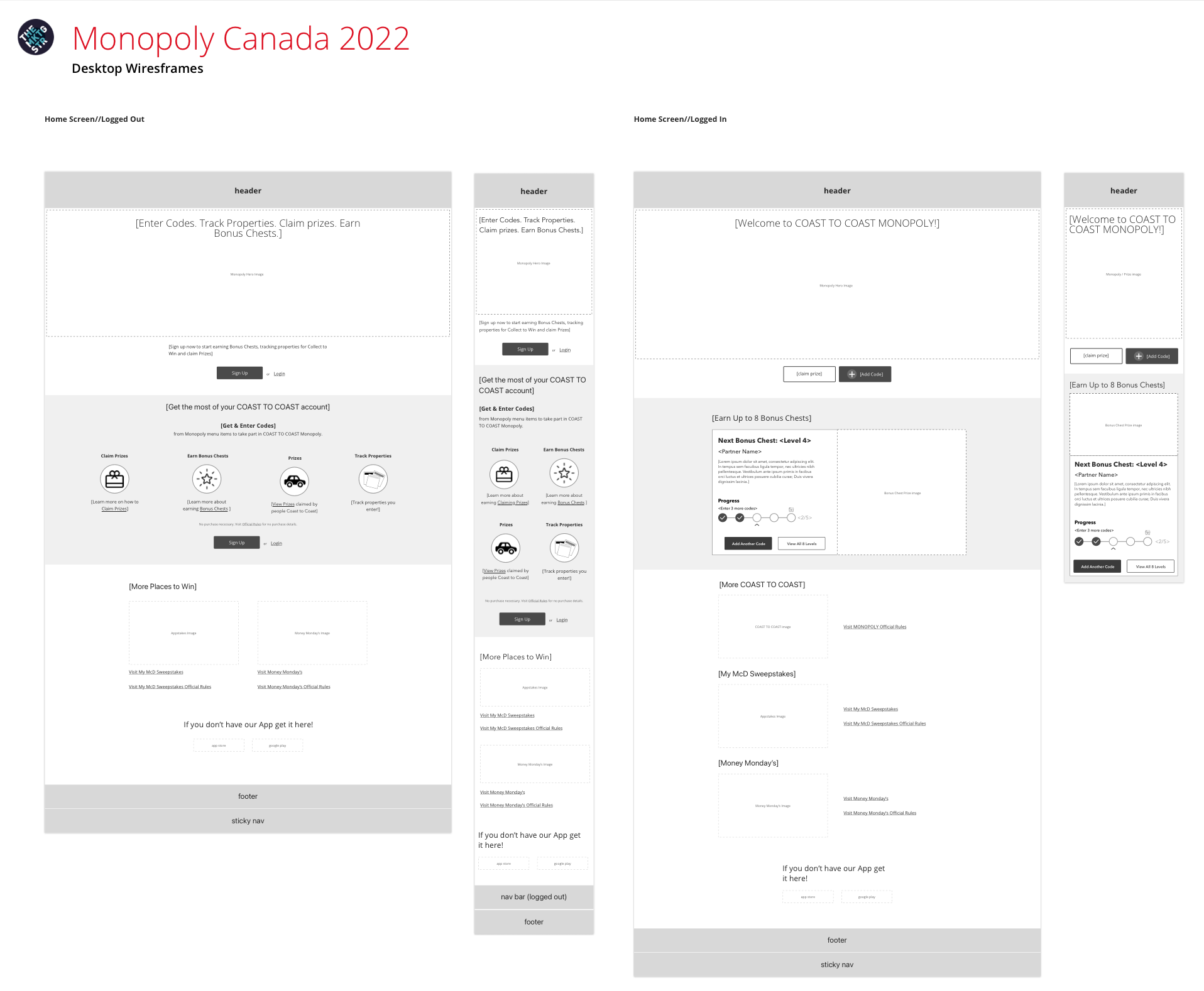
Bonus Chest Page
Add buttons to add another code and to view all 8 Bonus Chests to help increase user engagement and awareness.
Make it easy for people to see what the next Bonus Chest (reward for entering codes) and track their progress towards unlocking it.
Show the number “2/5” next to the progress bar and using other visual indicators like the arrow symbol.
Using descriptive language for buttons and copy.
Avoiding the use of things like carousels, which are not accessibility friendly.
Mobile Wireframes


Desktop Wireframes


Visual Design


UX Consulting Phase
The visual design went through five iterations in which I played a large role in by reviewing each screen in-depth and providing feedback for improving usability, accessibility, and technical feasibility, as well as the look and feel.
Here is some of the feedback:
Too many different styles. There should only be two button colors and they should all be the same shape. Adjacent buttons should not have the same color.
Add drop shadows to buttons.
Remove/shrink any graphics or illustrations that are overlapping a button.
Will the “Claim Prize” button on the home page always show up? Most of the time users won’t have a prize waiting to be claimed?
Bottom Nav Bar:
Should have a singular color scheme.
“Add Code” feels disabled.
Add divider lines between nav bar buttons
Most if not all the graphics are very large and take up a ton of space and push up against or cover copy and buttons.
“How to Claim” link is indented, unlike the “View Collections” link

What I Learned
Research: Not all UX projects require or have the luxury of conducting extensive user research. Sometimes you have to work off of historical data and use faster methods for coming up with the “why” for designing something a certain way.
Accessibility: McDonald’s has very high accessibility standards— so I quickly learned a lot about accessible UX/UI design.
Design of a multimodal pervasive computing system that includes mobile and tablet applications. UCHEF is a smart-kitchen tool that allows people to find recipes based on the ingredients they already have on-hand.